Table of Contents
What Is the Elementor Toggle Widget?
The Elementor Toggle Widget is a free widget built into the core Elementor plugin that lets you create collapsible content boxes on any page or post. Each item in a toggle has a title (visible by default) and a content area (hidden by default). When a visitor clicks the title, the content expands below it. Click again and it collapses back. This is different from a simple text block because all toggle items start fully closed when the page loads — your visitor is in control of what they open. It keeps the page looking clean and uncluttered, even if you have a lot of information to share. You do not need Elementor Pro. The Toggle Widget is included in the free version of Elementor, which is one of the reasons I recommend it so often to my clients who want a professional result without spending extra on plugins.
When Should You Use the Toggle Widget on a Local Business Website?
In my experience building websites for salons, clinics, restaurants, gyms, and coaches, the Toggle Widget is most useful in the following situations: – FAQ sections — Add a question as the heading and the answer inside. This is probably the most common use case I see. – Service details — List your services as toggle headings and hide the full description inside each one. – Product features — Great for any client selling a course, a package, or a product with multiple features to explain. – Pricing breakdowns — Show the package name as the heading and the inclusions inside. – Team bios — Show team member names and let visitors click to read more about each person. – Event schedules — List session times as headings and put the details inside. Essentially, any time you have content that is important but could be overwhelming if shown all at once, the Toggle Widget is a smart choice. It also helps reduce bounce rates because a cleaner-looking page encourages people to stay and interact.
How to Add the Toggle Widget in Elementor (Step by Step)
Adding the Toggle Widget to your page is very quick. Here is exactly how I do it for every client site: – Step 1: Open your page in the Elementor editor by clicking Edit with Elementor. – Step 2: In the widget search panel on the left, type “Toggle” in the search box. – Step 3: Drag the Toggle Widget from the panel and drop it onto the section of your page where you want it to appear. – Step 4: The widget will appear on your canvas with two default toggle items already in place — Toggle #1 and Toggle #2. These are just placeholders you will replace with your own content. That is all it takes to get the widget onto the page. The next step is customising the actual items inside it.
How to Add and Edit Toggle Items
Once the widget is on your canvas, click it to open the settings panel on the left. You will be in the Content tab by default. Here is what you can do: – Edit item titles and content — Click on Toggle #1 to expand it. Type your heading in the Title field and your full text in the Content area. Repeat for Toggle #2. – Add more items — Click the Add Item button at the bottom of the Toggle section to add as many items as you need. There is no limit. – Reorder items — Drag items up or down using the handle icon on the left side of each item row. – Delete an item — Click the X icon on the right side of the item row to remove it. – Add custom icons — You can set a custom icon for the expanded state and a different icon for the collapsed state. Choose from the Elementor icon library, upload an SVG, or select None if you prefer no icon. This is a small detail but it makes a big difference to how polished the final result looks. A practical tip I give all my clients: write your toggle titles as actual questions when building a FAQ section. So instead of “Refund Policy” use “What is your refund policy?” — it reads more naturally and it is better for SEO too.
How to Style Your Toggle Widget
After setting up your content, click the Style tab in the Elementor panel. This is where you make the toggle fit your website’s look and feel. The main styling options are split into two areas.
Toggle Container Styling
These settings control the overall look of the widget: – Border Width — Set the thickness of the border around the entire widget and between each item. – Border Color — Choose a colour that works with your brand palette. – Space Between — Add breathing room between each toggle item so they do not feel too cramped. – Box Shadow — Add a subtle shadow around the widget for a card-like effect. I personally keep the border simple and use a light grey or a brand accent colour. Heavy borders make the widget feel dated and busy.
Title Styling
These settings control how the heading of each toggle item looks: – Background — Set a background colour for the title bar. – Color — Choose the text colour for inactive (closed) titles. – Active Color — Choose a different text colour for the currently open title — this gives the user a clear visual cue about which item is expanded. – Typography — Set the font family, weight, and size for the title text. – Text Shadow — Add a subtle shadow to the title text if needed. For most local business sites, I use the website’s primary brand colour as the Active Color and keep the inactive titles in dark grey. It is clean, it is readable, and it works on any device.
Toggle Widget vs Accordion Widget: What Is the Difference?
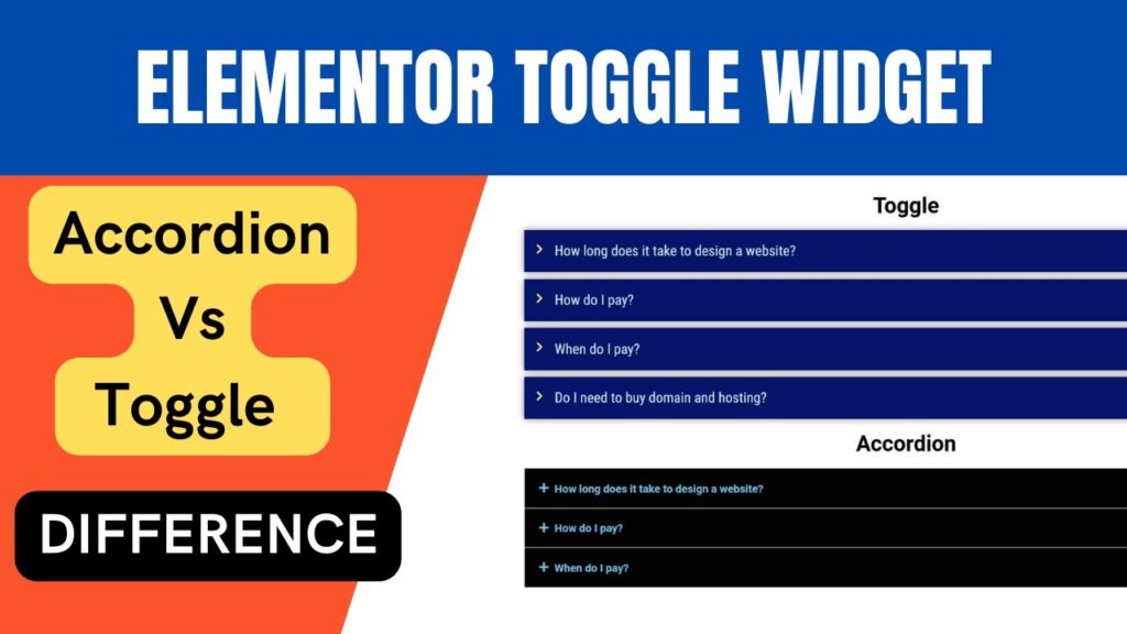
This is one of the most common questions I get, so let me clear it up simply. Both the Toggle Widget and the Accordion Widget display collapsible content — but they behave differently in one important way: – Toggle Widget — All items start closed when the page loads. The visitor must click to open any item. Multiple items can potentially be open at the same time. – Accordion Widget — The first item is expanded by default when the page loads. All other items remain closed. Opening one item automatically closes the previously open one. So which should you use? Here is my rule of thumb: – Use the Toggle Widget for FAQ sections and situations where none of the answers need to be visible by default — let users choose what they want to read. – Use the Accordion Widget when you want the first item to always be visible on page load, or when you are organising a large amount of structured content and want to guide the user through it step by step. For most of the local business sites I build — whether it is a physio clinic FAQ or a gym class schedule — the Toggle Widget is the better choice because it keeps the page looking fully clean on first load.
How to Enable FAQ Schema on Your Toggle Widget
This is a feature that most people building their own sites miss entirely, and it is genuinely valuable for SEO. When you build an FAQ section using the Toggle Widget, Elementor gives you the option to enable FAQ Schema markup — this tells Google that the content on your page is structured as questions and answers. With FAQ schema enabled, Google can display your questions and answers directly in the search results as rich snippets, which means more visibility without needing to rank higher. To enable it: – Click on your Toggle Widget to open the settings panel. – Go to the Content tab and scroll down to find the FAQ Schema toggle. – Switch it to On. One important thing to note: only one widget per page can have FAQ schema enabled. So if you have multiple toggle or accordion widgets on the same page, only enable schema on the one that contains your actual FAQs. Do not enable it on widgets you are using just for layout purposes.
Tips for Getting the Best Results from the Toggle Widget
After setting up toggle sections on hundreds of local business websites, here are the things that make the biggest difference: – Keep titles short and scannable — Visitors skim before they read. Your toggle titles should immediately tell them what is inside. Aim for under 10 words per title. – Do not overload the content inside — The toggle is meant to make content digestible. If you paste 500 words inside a single toggle item, you have just moved the problem. Keep answers concise and direct. – Match styling to your overall site — Use the same fonts, colours, and border style that appear elsewhere on your site. A mismatched toggle widget looks like an afterthought. – Use it for FAQs and enable schema — If you are using the toggle as an FAQ section, always turn on FAQ Schema (as described above). It takes two seconds and can improve your Google search appearance. – Do not use it everywhere — I have seen sites where every section is a toggle. That gets confusing fast. Use it where content genuinely benefits from being hidden by default. For everything else, keep content visible.
Frequently Asked Questions
Is the Elementor Toggle Widget free?
Yes, the Toggle Widget is included in the free version of Elementor — you do not need Elementor Pro. You can drag it onto any page and start using it right away without upgrading.
What is the difference between the Elementor Toggle Widget and the Accordion Widget?
The main difference is how they behave on page load. With the Toggle Widget, all items start closed and the visitor opens whichever one they want. With the Accordion Widget, the first item is open by default. Use Toggle for FAQs where you want a fully clean initial view.
Can I use the Elementor Toggle Widget to create an FAQ section?
Absolutely — it is one of the best uses for it. Add each question as a toggle title and the answer in the content area. Then enable the FAQ Schema option in the Content tab to get potential rich snippet visibility in Google search results.
How do I add more items to the Elementor Toggle Widget?
Click on the Toggle Widget in the Elementor editor, go to the Content tab, and click the Add Item button at the bottom of the toggle items list. You can add as many items as you need and reorder them by dragging.
Can I customise the icons on the Toggle Widget?
Yes. In the Content tab you can set a custom icon to represent the expand action and a different icon for the collapse action. You can choose from Elementor’s icon library, upload a custom SVG, or choose None if you prefer no icon at all.
Does the Elementor Toggle Widget work on mobile devices?
Yes, the Toggle Widget is fully responsive. It adapts to any screen size automatically, so it works correctly on desktops, tablets, and mobile phones without any extra configuration.
Can I have multiple toggle items open at the same time?
Yes — unlike the Accordion Widget (which closes one item when you open another), the Toggle Widget allows multiple items to be open simultaneously. Each item operates independently when clicked.
Final Thoughts
Thanks so much for reading this far — I hope this tutorial has made the Elementor Toggle Widget feel completely straightforward to use. It is genuinely one of those widgets that makes a big visible difference on a local business website without adding any complexity or slowing your page down, which is always my goal. If you are more of a visual learner, make sure you check out my YouTube video tutorial on this exact topic — I walk through the whole thing on screen so you can follow along step by step. If you have any questions about what I have covered here, drop them in the comments below and I will get back to you. And if you would like me to set this up on your website for you, feel free to reach out to me directly through the contact page on paramfreelance.com — I am always happy to help.
I hope that this article on How to use Elementor Toggle Widget will help you. Read more articles on Elementor Tutorials.
Do not forget to subscribe to our Quick Tips Youtube Channel for upcoming videos on Website Design, WordPress Tutorials, Elementor, and WooCommerce tutorials.