Table of Contents
What Is the Elementor Navigation Menu Widget?
The Elementor navigation menu widget — also called the Nav Menu widget — is a dedicated Elementor Pro widget that lets you display and fully style a WordPress navigation menu anywhere on your website. Instead of relying on your theme’s default header styles, you get complete visual control over every aspect of the menu: fonts, colors, spacing, hover animations, dropdown behavior, and how it collapses on mobile devices. Most websites include a menu as part of their header, and these menus give visitors quick, easy access to the different pages of a site. The Nav Menu widget goes much further than a basic theme menu — you can place it anywhere on a page, add hover pointer animations, control exactly when the hamburger icon kicks in on mobile, and style the dropdown items to match your brand perfectly. For local business sites especially — salons, clinics, gyms, restaurants — having a clean and professional menu builds immediate trust with visitors.
Requirements: Free vs Pro
Before you get started, one important thing to know: the Nav Menu widget is a feature of Elementor Pro. If you are using the free version of Elementor, you will not find this widget in the panel. With Elementor Free, you have two options: – Use your theme’s built-in header and navigation menu (which works fine for very simple sites) – Install a free plugin like the Elementor Header and Footer Builder, which gives you some basic menu control without needing Pro If you are building a site for a client or you want full design control — and I recommend this to all my clients — Elementor Pro is worth every cent. It includes the Theme Builder so you can design the entire header and footer visually, and the Nav Menu widget is right there waiting for you. For anyone building more than one or two sites, the investment pays for itself quickly.
Step 1 — Create Your Menu in WordPress First
This is the step most beginners skip, and it causes all the confusion. You cannot build your menu structure inside Elementor. The menu links and hierarchy are created in WordPress, and then the Nav Menu widget pulls that menu in and lets you style it. Here is how to create your menu in WordPress: – Go to your WordPress dashboard and navigate to Appearance > Menus – Click “Create a new menu” and give it a name (for example, “Main Navigation” or “Header Menu”) – Add your pages, posts, or custom links from the left-hand column — just tick the boxes and click “Add to Menu” – Drag and drop menu items to reorder them. To create a dropdown submenu, drag a menu item slightly to the right underneath another item — WordPress will indent it to show it is a child item – Assign the menu to a location (select “Primary Menu” or whichever location your theme supports) – Click “Save Menu” Once your menu is saved in WordPress, it will appear in the Elementor Nav Menu widget’s dropdown list. Creating this first ensures full compatibility with the widget and prevents rendering issues down the line.
Step 2 — Add the Nav Menu Widget in Elementor
Now that your menu structure exists in WordPress, it is time to add it to your site using Elementor Pro. The most common place to add a navigation menu is inside a Header template. Here is how: – In your WordPress dashboard, go to Templates > Theme Builder – Click “Add New” and select “Header” as the template type – Give it a name and click “Create Template” – The Elementor editor will open with a blank canvas – In the Elementor widget search bar on the left, type “Nav Menu” – Drag and drop the Nav Menu widget into your header layout – In the Content tab on the left panel, look for the “Menu” dropdown and select the menu you just created in WordPress – Your menu items will appear on the canvas immediately At this point you have a functional navigation menu showing on the canvas. The next steps are all about making it look exactly how you want.
Step 3 — Configure the Layout Settings
With the Nav Menu widget selected, look at the Content tab in the left panel. Under the Layout section, you have several key settings: – Layout: Choose between Horizontal, Vertical, or Dropdown. Horizontal is the most common choice for desktop header menus and spreads the menu items from left to right. Vertical stacks them from top to bottom, which works well for sidebar navigation. Dropdown shows a single toggle icon that expands all menu items — useful for a very minimal header design. – Alignment: Set the alignment of your menu items — Left, Center, Right, or Justified (which spreads items across the full column width). For most local business sites, I align the menu to the right so it sits nicely beside a left-aligned logo. – Pointer: This is the hover indicator — the mark that appears when someone hovers over a menu item. Options include None, Underline, Double Line, Framed, Overline, and Background. Each pointer style comes with its own set of animation effects. – Animation: Once you pick a pointer style, you can choose the animation for it — Fade, Slide, Grow, Drop In, and others depending on the pointer type. Keep this subtle for professional-looking sites. I normally stick with Fade for client sites. – Submenu Indicator: This is the small icon that shows next to a menu item that has child items beneath it. You can choose from Classic, Chevron, Angle, Plus, or None.
Step 4 — Style Your Menu (Colors, Fonts, Pointers)
Click on the Style tab to control the visual appearance of your menu. This is where you can make your navigation look like it was built by a professional designer — or like it was left on default settings. Here is what to focus on: Under “Main Menu” styling: – Typography: Set the font family, size, weight, and text transform (uppercase is popular for clean modern headers). Match the font to your site’s global typography settings for consistency. – Text Color: Set the normal color for your menu items and the hover color. These should have enough contrast against your header background. Also set the Active state color — this is the color of the current page’s menu item, which helps visitors know where they are. – Background Color: You can set a background color behind each menu item for normal, hover, and active states. Many sites keep this transparent but add a subtle hover background for interactivity. – Horizontal Padding and Vertical Padding: Control the spacing around each menu item. More padding generally looks cleaner and gives the menu a more premium feel. – Space Between: Controls the gap between individual menu items. Under “Dropdown” styling (if you have submenus): – Set the background color, text color, and hover colors for your dropdown items – Adjust typography, spacing, divider lines between items, and box shadow – Add a border radius for slightly rounded dropdown boxes if that suits your design
Step 5 — Set Up Dropdown Submenus
If you added child items in your WordPress menu (by indenting items under a parent item), those will automatically create dropdown submenus in the Nav Menu widget. Elementor handles the dropdown behaviour automatically — you just need to style them. A few things to configure for dropdowns: – Submenu Indicator: Make sure you have an indicator icon set (chevron or angle is cleanest) so visitors know a dropdown exists – In the Style tab, click on the Dropdown section to style the dropdown box separately from the main menu bar – Set a clear background color so the dropdown is readable — a white or dark solid background usually works better than transparent – Under the Content tab, you can also set dropdown animations such as fade or slide to make the dropdown feel smoother For most small business sites — a salon, a clinic, a restaurant — I keep submenus to one level only. Deep multi-level menus confuse visitors on mobile and add unnecessary complexity. Keep the menu simple and visitors will thank you for it.
Step 6 — Make Your Menu Mobile Responsive
Mobile responsiveness is where most DIY navigation menus fall apart. A horizontal desktop menu does not fit on a phone screen, so Elementor automatically converts it into a hamburger toggle menu below a certain screen width. Here is how to set this up properly: In the Content tab, scroll down to the Mobile Dropdown section: – Breakpoint: Choose at what screen size the horizontal menu switches to a hamburger toggle. “Tablet” means the hamburger appears on screens below 1025px (both tablets and phones). “Mobile” means it only appears on phones below 768px — tablets will still show the horizontal menu. For most sites, I recommend setting it to Tablet so mobile users always get the toggle. – Full Width: Toggle this on so the dropdown menu stretches across the full screen on mobile — this is much easier to tap and looks more professional. – Toggle Button: Make sure this is enabled — this is the hamburger icon (three horizontal lines) that visitors tap to open the menu on mobile. – Toggle Align: Align the hamburger icon to the left, center, or right. Right is most common for standard header layouts where the logo is on the left. To check how your mobile menu looks, use Elementor’s responsive preview mode — click the tablet or phone icon at the bottom of the editor. What looks great on desktop can sometimes break on mobile, so always check before publishing. In the Style tab, you can also style the Toggle Button itself — change the icon color, background color, border, and size to match your header design.
Common Nav Menu Problems and How to Fix Them
After building 1800+ websites, I have seen the same navigation menu issues come up again and again. Here are the most common ones and how to solve them: – Menu not showing in the widget dropdown: This means you have not created a menu in WordPress yet, or you have not saved it. Go to Appearance > Menus, create the menu, add your pages, and save it. Then go back to Elementor and refresh. – Menu not appearing on the live site: Check that your Header template has been published and that the display conditions are set correctly. In the Theme Builder, click Publish, then set the condition to “Entire Site” if you want it on every page. – Dropdown not working on mobile: Make sure the Toggle Button is enabled in the Mobile Dropdown settings and that the Breakpoint is set to Tablet or Mobile — not None. – Hover effects not working: Check the Style tab and make sure you have actually set a hover color or hover pointer animation. Also clear your browser cache — cached styles can make it look like changes are not applying. – Broken layout after editing: Check for conflicting CSS from your theme or another plugin. You can use the browser’s inspect tool to see which CSS rule is overriding Elementor’s styles.
Pro Tips for a Clean, Fast Navigation Menu
Here are a few practical tips I always share with clients when setting up their navigation: – Keep it to five to seven menu items maximum. More than that and visitors get overwhelmed. If you have lots of pages, use dropdown submenus to organise them — but do not go more than one level deep. – Avoid fancy animations on the main menu items. A subtle Fade pointer is all you need. Heavy animations slow the perceived performance of the page and can feel unprofessional on local business sites. – Match your menu font to your site’s global font settings. Consistent typography is one of the easiest ways to make a site look polished. – Always test on a real mobile device — not just the Elementor responsive preview. Sometimes mobile browsers render things slightly differently. – If you want the menu to stay visible as the user scrolls, you can make the header sticky. In the Elementor Header template, click on the Section/Container settings and look for the Sticky option under the Advanced tab. This is particularly useful for service-based business sites where you want the contact link always visible. – Use a clear, high-contrast color for your active menu item state. This helps visitors know which page they are currently on — a small detail that improves the overall user experience significantly.
Frequently Asked Questions
Is the Elementor navigation menu widget free?
No, the Nav Menu widget is a feature of Elementor Pro and is not available in the free version of Elementor. If you need a navigation menu without Pro, you can use your theme’s built-in menu or install a free plugin like the Elementor Header and Footer Builder.
How do I add a dropdown submenu in Elementor?
Dropdowns are created in WordPress first, not inside Elementor. Go to Appearance > Menus and drag a menu item slightly to the right beneath a parent item to make it a child (dropdown) item. Once saved, the Elementor Nav Menu widget will automatically display those items as a dropdown.
How do I create a hamburger menu in Elementor?
In the Nav Menu widget’s Content tab, scroll to the Mobile Dropdown section, enable the Toggle Button, and set your Breakpoint to Tablet or Mobile. The hamburger icon will automatically appear on screens below that breakpoint width, and visitors can tap it to expand the menu.
Can I put the Elementor nav menu widget anywhere on a page?
Yes, the Nav Menu widget can be placed anywhere in Elementor — not just in a header template. You can add it inside a page, a footer, or even within a post. This makes it flexible for creating secondary navigation bars or footer menus.
Why is my Elementor nav menu not showing on my live site?
The most common reason is that your Header template in the Theme Builder has not been published with the correct display conditions. Click Publish on the header template, then set the display condition to “Entire Site” to make it appear on all pages.
How do I make my Elementor navigation menu sticky?
Select the Section or Container that wraps your header in the Elementor editor, go to the Advanced tab, and look for the Sticky option under Motion Effects or Sticky settings. Enable it and choose Sticky to Top. This keeps the menu visible as visitors scroll down the page.
Final Thoughts
Thanks for reading all the way through — I hope this tutorial makes setting up the Elementor navigation menu widget much less intimidating. The key thing to remember is that the menu structure lives in WordPress (Appearance > Menus) and the styling lives in Elementor. Once those two pieces click together, everything else falls into place naturally. If you are more of a visual learner, make sure you watch the video tutorial I have published — it walks through every step in real time so you can follow along on your own site. If you have a question about something specific — maybe a dropdown is not behaving, or you are not sure how to style the mobile toggle — drop it in the comments below and I will help you sort it out. And if you would rather just have this set up properly on your site without spending hours on it yourself, feel free to reach out to me directly at paramfreelance.com. Happy to help!
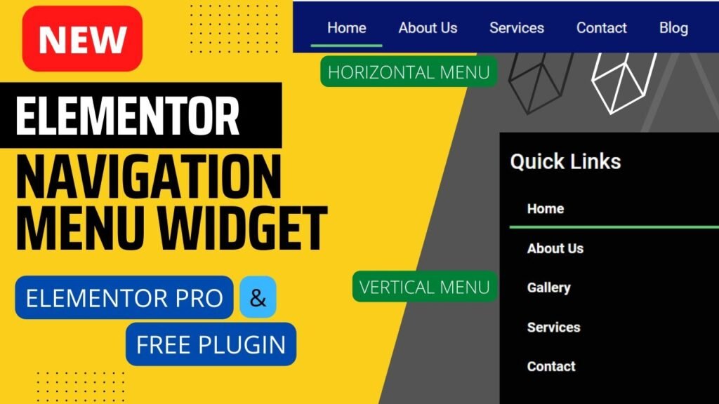
I hope that this article on How to use Elementor Navigation Menu Widget. Read more articles on Elementor Tutorials.
Do not forget to subscribe to our Quick Tips Youtube Channel for upcoming videos on Website Design, WordPress Tutorials, Elementor, and WooCommerce tutorials.